Oct - Dec 2025


01
A dense and difficult-to-read interface
02
Limited understanding of the game mechanics
The similarity scores and progression system lacked clarity, making it difficult for new players to fully understand how the game worked.
03
A less immersive visual identity
The game’s visual universe did not fully reflect its playful and competitive nature.
Starting from the existing product, we worked on a mobile redesign focused on readability, smoother user flows, and a more modern visual identity. The goal was to improve gameplay understanding while creating a more immersive and engaging experience.
Areas of focus
1. Clarifying essential information
Rethinking the visual hierarchy to make scores and progression easier to understand.
2. Simplifying user flows
Making navigation smoother and improving the accessibility of the different features.
3. Reinforcing the game’s universe
Creating a more modern and immersive visual identity through branding, colors, and 3D illustrations.
01
Colors
A vibrant color palette designed to create a modern and immersive mobile experience. The purple gradients reinforce the visual identity while highlighting key interface elements.

02
Logo
The Cementix logo was designed to represent creativity, ideas in motion, and the energy of the community. Inspired by the image of a boiling brain through an expressive flame shape, it brings a dynamic, modern, and engaging identity to the project.

03
Wireframes
The wireframes helped structure the different user flows and organize the application’s features in a clear and intuitive way. This step helped define the screen architecture before designing the final interfaces.

04
Design system
We created a small design system to harmonize components and ensure better visual consistency throughout the application.

05
Final interfaces
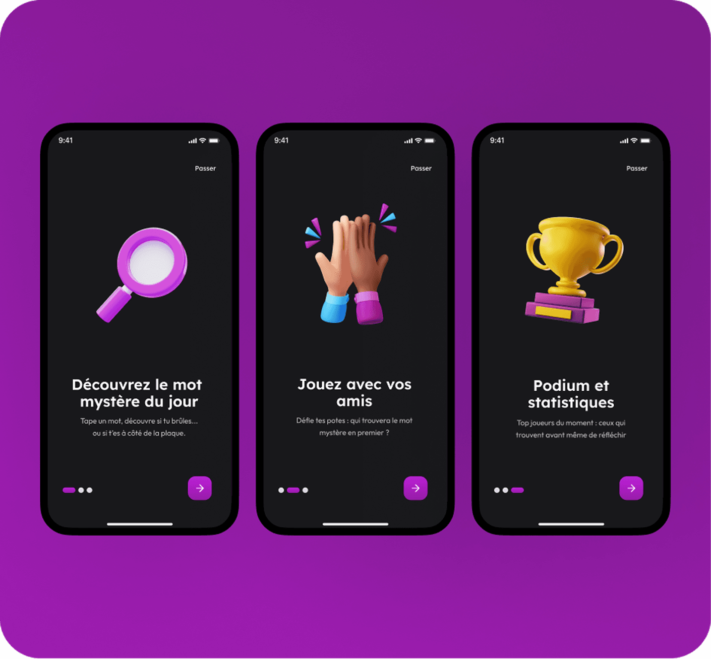
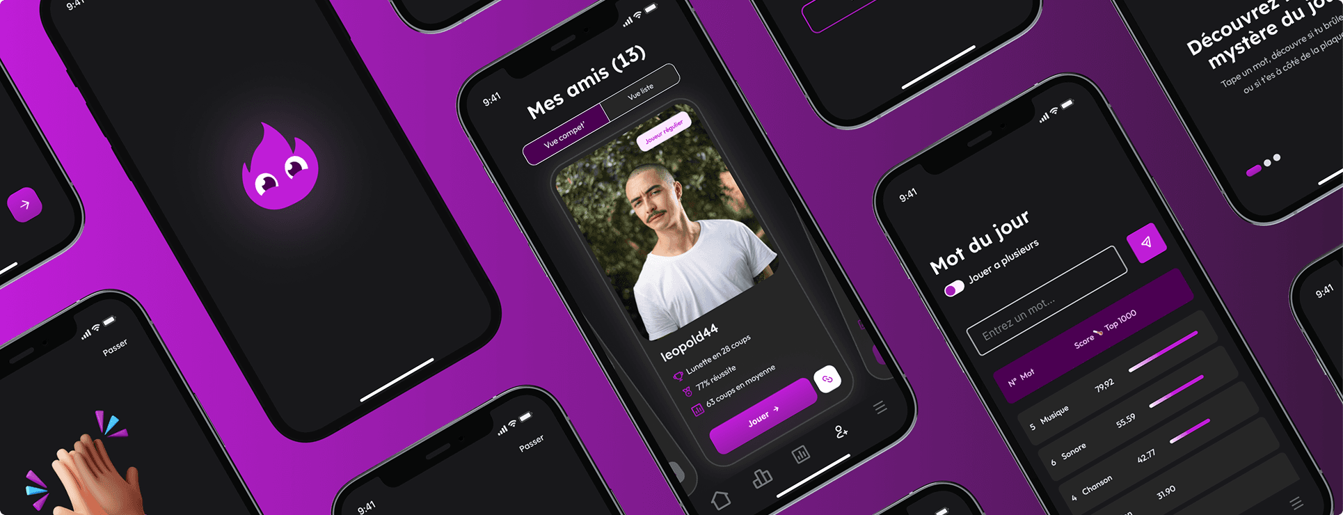
The final interfaces were designed by integrating the project’s new visual universe in order to create a more modern, immersive, and engaging mobile experience.
Main Features