
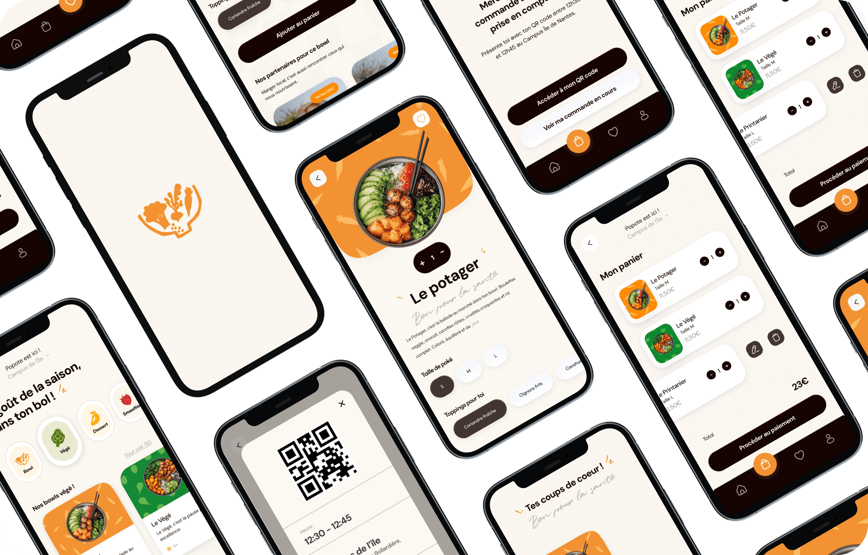


Branding
Apr - Jun 2025


01
Limited lunch breaks
Users need a fast and convenient solution that easily fits into a busy daily schedule.
02
Lengthy ordering experiences
Ordering food can quickly become frustrating when the experience lacks clarity or requires too many steps.
03
A need for transparency and local sourcing
Consumers increasingly value product origin, fresh ingredients, and locally sourced food.
The project originated from a simple observation from both student and professional daily life: at lunchtime, many people eat quickly due to limited time and often rely on convenient but unbalanced food options. Through personal experiences, informal discussions, and observations of surrounding behaviors, we identified several recurring frustrations related to lunch break experiences.
Key insights
1. Time strongly influences food choices
When lunch breaks are short, speed often becomes a higher priority than meal quality.
2. Ordering experiences need to feel instant
Users expect a simple, seamless, and easy-to-understand experience within seconds.
3. Consumers seek greater transparency
Product origin, freshness, and local sourcing strongly influence the perception of quality.
01
Understanding users
To better understand user expectations and lunchtime habits, we created a persona reflecting the needs of young professionals seeking a fast, seamless, and quality-focused food experience.

02
User journey
We designed a simplified user journey focused on speed, clarity, and convenience, allowing users to order and collect their meals with minimal friction.

03
Visual identity
The visual identity of Popote was designed to reflect freshness, simplicity, and accessibility. Created on Procreate, the logo combines playful organic shapes with a warm color palette inspired by fresh ingredients.

04
Wireframes
The wireframes helped define the application’s structure and organize the user experience in a clear and intuitive way. This stage allowed us to validate the screen architecture before moving into the final interface design phase.

05
Final Interfaces
The final interfaces reflect the visual identity and UX intentions developed throughout the design process. The experience was designed to feel clear, intuitive, and engaging while supporting fast interactions.

Main Features


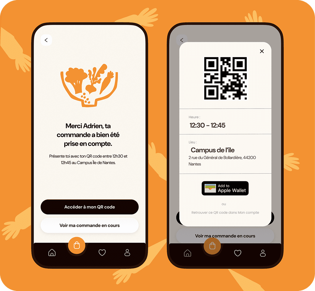

Each bowl highlights regional partners and local producers to reinforce transparency and the service’s local identity.


